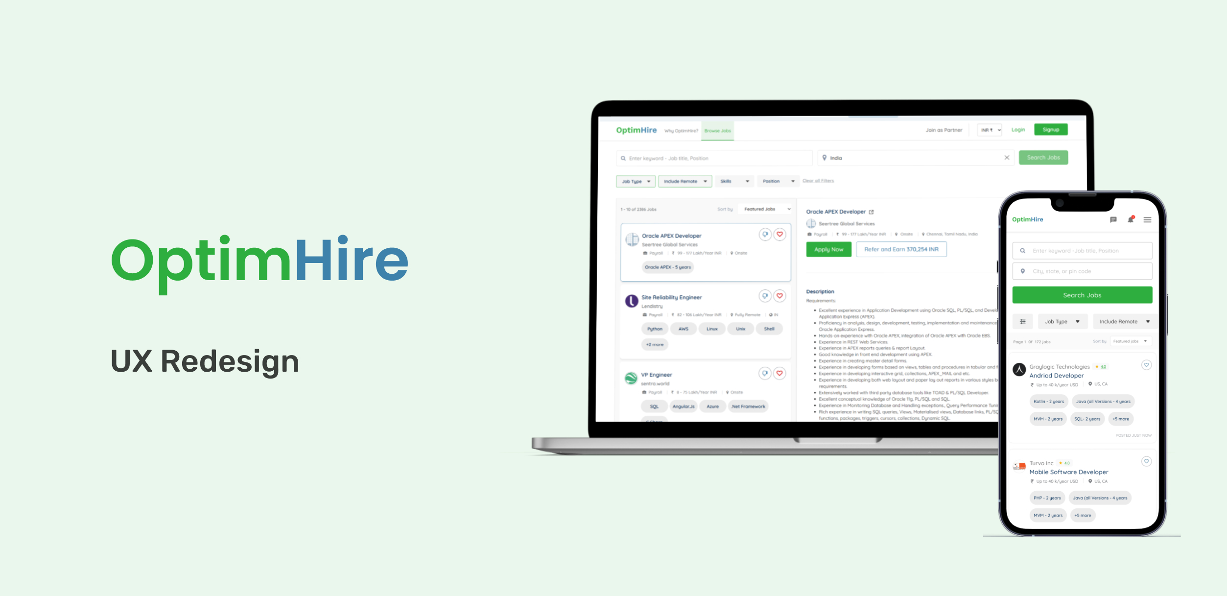
OptimHire is a global platform connecting employers, job seekers, and recruiters. The Candidate Portal, a crucial component, faced usability challenges that hindered user engagement and task completion. My objective was to enhance the user experience by identifying pain points through usability testing and implementing a comprehensive UX redesign.
🎯 Objectives
Identify user goals, pain points, and frustrations within the Candidate Portal. Improve the effectiveness of profile setup, job search, and application processes. Enhance overall user satisfaction and engagement.
🔍 Research & Methodology
User Surveys & Interviews: Conducted surveys and interviews with a diverse group of candidates, including active, inactive, and new users. Employed the “think aloud” method during usability testing sessions to gain insights into user thought processes and expectations. Key Findings: Overwhelming Context: Users found the interface cluttered, leading to confusion. Lack of Updates: Absence of real-time feedback left users uncertain about their actions. Distracting Elements: Non-essential features diverted attention from primary tasks. Incomplete Profile Setups: 5 out of 11 candidates couldn’t complete their profiles fully.
🧪 Usability Testing Insights
Before the redesign, we conducted moderated usability sessions with 11 participants (8 desktop, 3 mobile) to uncover friction points.
👥 Participant Snapshot
Attribute
Count
New Users
5
IT Background
9
Avg. Completion
70%
Mobile Users
3
Profile Dropouts
4
🧠 Key Findings
🔴 Frustration Points 9 of 11 users cited slow loading of search/profile pages. 4 of 4 new users wanted Google login to avoid password friction. 3 users wanted the ability to withdraw applications, but the option was missing. Users struggled with resume uploads, unclear error states, and broken form logic. Non-IT users felt blocked during onboarding due to mandatory fields. 🟢 What Worked Well Job alerts and search UI received positive mentions. Job status tracking was appreciated. “Refer & Earn” concept was logical and clear to most testers.
🎯 Design Goals
Based on the testing insights, we aimed to: Improve task completion for onboarding and job search Reduce bounce rate from first-time users Enhance navigation clarity and introduce progressive disclosure for filters and job cards
✍️ My Role & Process
Led usability testing setup, task design, and moderation. Synthesized results into UX pain points and success metrics. Iterated wireframes and prototypes in Figma. Collaborated closely with developers to align build feasibility.
🛠️ Design Solutions
Simplified Interface: Reduced clutter by prioritizing essential features and information. Real-Time Feedback: Implemented status indicators and confirmations to keep users informed. Focused Navigation: Streamlined user flows to guide users through tasks efficiently. Enhanced Onboarding: Redesigned the profile setup process to be more intuitive and user-friendly.
📈 Results
Improved Task Completion: Post-redesign, there was a significant increase in successful profile completions. Enhanced User Engagement: Users reported a more satisfying and efficient experience. Positive Feedback: The new design received commendations for its clarity and usability.
📸 Visuals
Include screenshots or prototypes showcasing before-and-after designs, user flow diagrams, and key interface elements.
Landing Page — Before vs After
Old UX
New UX
Before: Overwhelming layout with excessive CTAs and poorly grouped elements. Inconsistent color usage diluted focus and confused first-time users. Visual clutter reduced content accessibility and made onboarding harder. After: Simplified layout with fewer, more meaningful CTAs. Better spacing and visual hierarchy to improve readability. Removed irrelevant client signup banner, focusing entirely on job seekers. Why It Worked: Clearer call-to-actions and breathing space helped improve first impressions and task orientation, especially for new users.
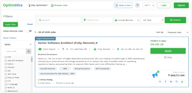
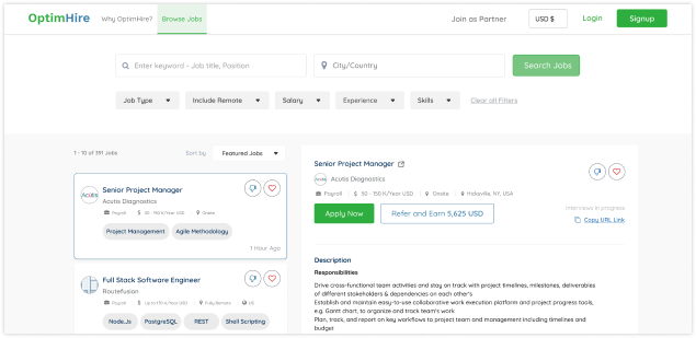
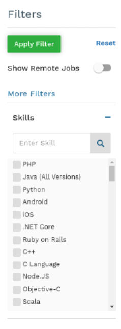
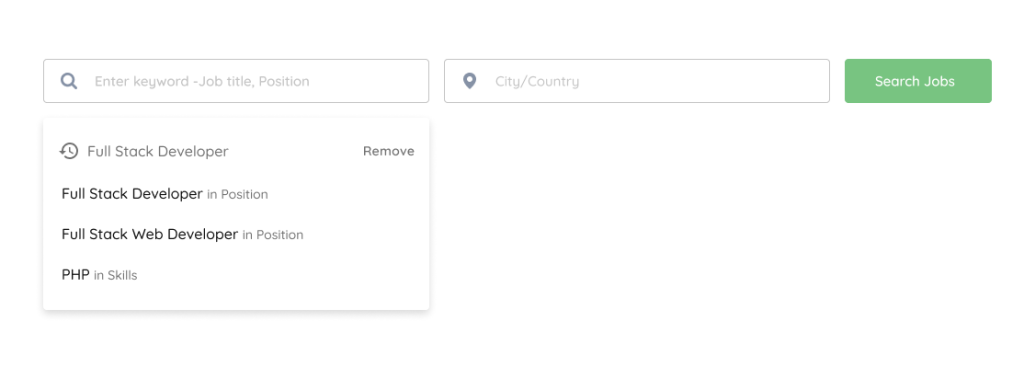
Search Filters — Before vs After
Old UX
New UX
Before: Long, expanded filter list consumed valuable screen real estate. No visual indicators for selected filters. Scrolling fatigue and decision paralysis due to information overload. After: Introduced collapsible filter chips with inline category controls. Clear visual indicators for active filters. Single-click reset button and better discoverability. Why It Worked: Reduced cognitive load, aligned with Hick’s Law, and provided a faster, cleaner way to tailor search results.
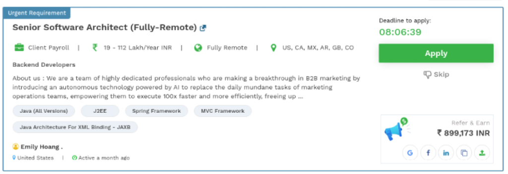
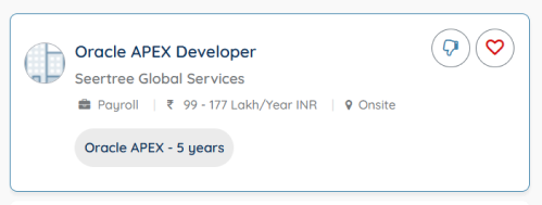
Job Cards — Before vs After
Old UX
New UX
Before: Cluttered with excessive data, icons, and confusing “last active” labels. Lacked visual grouping, overwhelming first-glance comprehension. No clear save or dislike mechanism. After: Cleaner layout with essential info like role, company, salary, location. Introduced “save” and “like/dislike” actions for better personalization. Visuals aligned to decision-making behavior (UX laws: Fitts, Scarcity). Why It Worked: Improved clarity and decision-making, allowing users to act or defer based on need—without friction.
Search UI — Before vs After
Old UX
New UX
Before: Generic search bar with no context or visual guidance. Lacked intelligent suggestions or query memory. After: Added typeahead suggestions and role/skill filtering. Cleaner input fields with structured placeholders. Prominent search action to guide first interaction. Why It Worked: Enhanced usability and relevance of search results, especially for job seekers using niche skill filters.
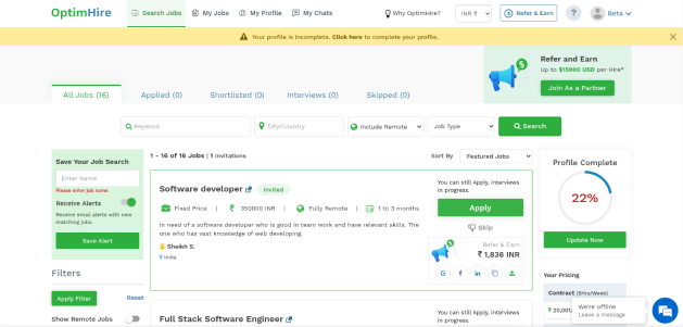
Header — Before vs After
Old UX
New UX
Before: Overloaded with more than 7 actionable items (violating Miller’s Law). Too many icons, leading to confusion and choice overload. After: Trimmed header down to essentials: jobs, signup, and key account actions. Focused on guiding the user toward their main goal (finding jobs). Why It Worked: Streamlined the UI and improved cognitive accessibility by reducing non-essential options upfront.
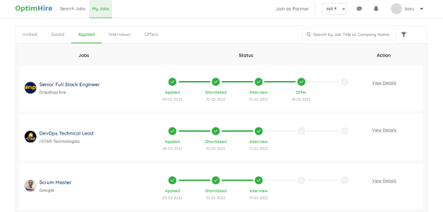
Job Tracking & Other Actions — Before vs After
Old UX
New UX
Before: Tracking stages cluttered and mixed with unrelated content. Users couldn’t easily view job status or take action quickly. After: Job status visually mapped with a clean progress indicator. Tabs separated major actions: applied, invited, shortlisted, etc. “View Details” encouraged clarity before further action. Why It Worked: Improved tracking experience reduced confusion and made job follow-ups manageable.