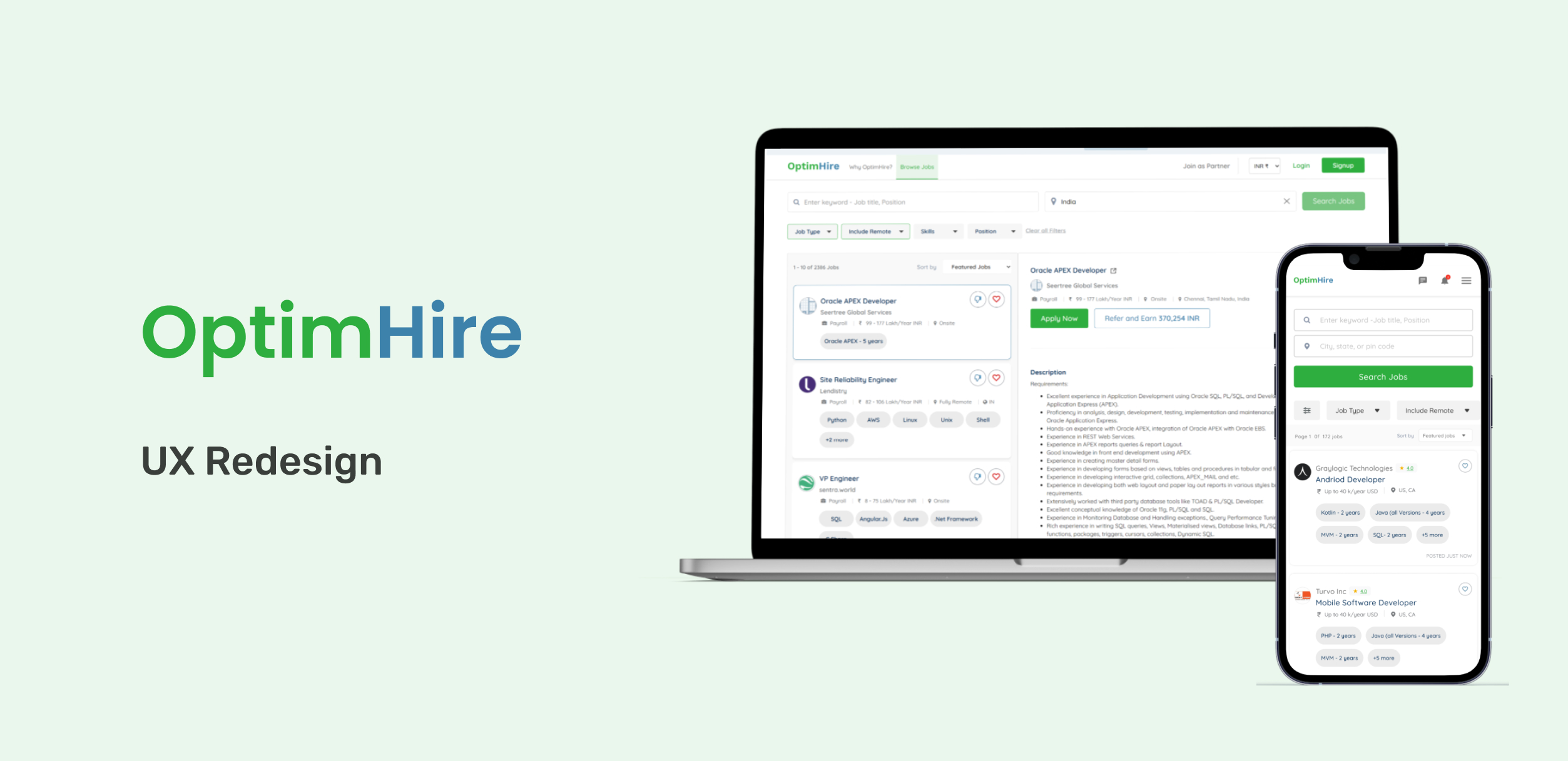
About the Project
OptimHire is a three-way global ecosystem which connects employers, job seekers and recruiters. Employers can create a company profile, invite team members, post jobs Job Seekers can create a complete candidate profile, search for the available jobs, apply for a job, view status of the jobs under my jobs, chat with the employers, refer a job and earn commissions by becoming a partner. Recruiters can use the partner portal to view the referral dashboard, view jobs & share the jobs to the matching candidates
Why we are making the changes?
We interacted with candidates to know whether they were able to achieve their goals and what frustrations and pain points they faced in our portal. So we conducted some surveys and interviews to know where they were finding the complexity and noted their suggestions. We did some extensive research by comparing our portal with our direct and indirect competitors.
Our Goal
To improve the candidate experience and increase engagement rates by implementing design thinking. Our main focus is to engage the user on the landing page, make them discover and apply for their dream job, and increase the conversion rate continuously. As a process, we need to improve the usability of tracking the applications and interacting with them.
Tools we used
Figma, Google Forms, Google Meet, Google Docs
Deliverables
- Competitive Analysis
- Improvised user flow
- Improvised information architecture
- UI Designs
Design Process
Research
- Surveys and Interviews
- Product evaluation
- Competitive analysis
Define
- Defining Problem Statement
- Identifying Root Causes
Ideate
- Applying the most suitable solutions
- Recreating the User flows
- Simplifying the Architecture
Prototype
- Redesigning the design elements
- Rebuilding the interactions
- Versions for testing
Insights
After conducting each user test, all researchers completed a debrief that highlighted the pain points, severity score, frequency, and category. I was involved in each test and held a debrief afterward to compile a list of usability issues that were revealed. These issues were organised within a finding chart. This discussion resulted in five overarching findings and recommendations to improve the website.
Landing Page
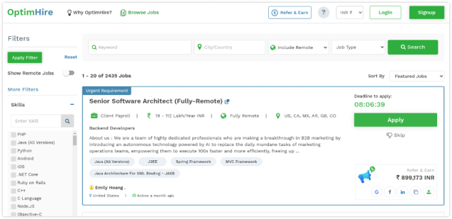
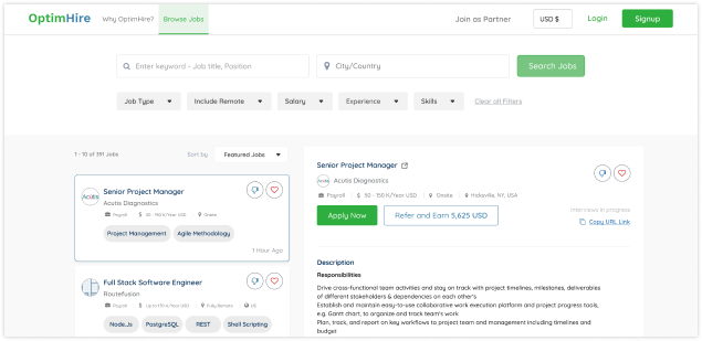
What led us to make this UX improvement?
- In the Old design, there were too many CTA’s on the landing page, so there is a chance to create a confusion on user’s mind or action.
- Too many elements and color usage in unnecessary places reduces the content accessibility
- No breathing space in the page
- As most of the interactable elements are important, we updated the new design matching the older visual elements which will be easy for the old user to adapt and if we don’t, we may loose target/ returning users.
- Removed the emphasis for the signup as client banner as it is irrelevant to a user who is here to find their dream job.
Search Filters
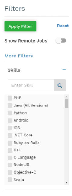

What led us to make this UX improvement?
- Once users have begun their search, they should feel encouraged to filter and drill into content by utilizing the broad, yet controlled, structure of subjects.
- Nesting subjects into a collapsible and expandable format saves the user time while also offering an understandable map of the archive’s subject organisation.
- We can use Hick’s law here (“the time to make decisions increases with the number and complexity of choices”).
- In the old design, the user needs to scroll a lot in order to view or access the available filters, and vast screen space is taken up by the filters, as by default they are in expanded mode and accessed once for setting the job search results.
- In the new design, it is accessible from anywhere, shows indications for modified filters, and takes little space on the screen.
One-click button to reset the filters
Job Cards
Goals
Explore major concerns within the site on how users interact with the provided features, effectiveness of profile setup, job search and job application.
What led us to make this UX improvement?
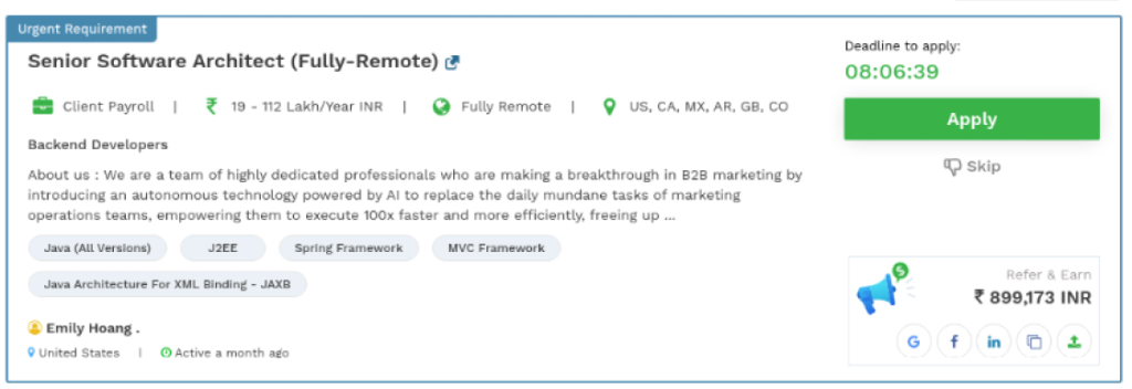
- The job posting date should read as time since posting (ex: posted one hour ago).
- Eliminate visual distinction and unwanted content or distractions from jobs as much as possible.
- Lack of confidence when viewing the “last active” client on the job post is found unnecessary or needs to be resolved by the Optimhire end.
- Users are confused about the skip feature; rather, provide a save job feature to users so they can apply later or after reviewing some jobs.
- Provide a dislike feature to know what’s wrong with the job posting rather than just skipping it.
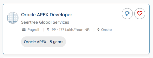
- In the new design, we organized and updated the job card with minimal details, which are basic for candidates to open or apply for.
- And generally, when the user is not able to decide, it is better to save it for later review. So, we have added an option to like or save it for later.
- At the same time, we need to know why the job has been skipped. So, we have given an option for feedback on why they were skipping the job posting.
- Coming to the refer and earn element, which is the least priority to the user who comes here to apply for a job, and most of the users are not aware of the concept. So avoid paying unnecessary attention to the details.
- Deadline to apply (scarcity ux law). It is unnecessary to apply this law here because, Forcing the user to apply and having so many applicants for a job is a bit difficult for recruiters to filter.
Search UI

What led us to make this UX improvement?
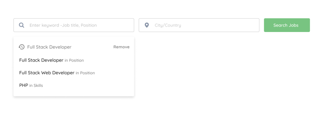
- Incorporating a prominent search bar on the archive homepage will clearly communicate to users of all levels how to begin a search for content.
- In addition, providing suggested terms in the search bar encourages users to interact with the tool. It will also signal to visitors the core purpose of the website.
- The first thing users can do when they land on this screen is search for a job. So, the search functionality and approach should be minimal.
- At the same time, search suggestions and search history also help the user with their query. So, we updated this search interface minimalistic and user-focused as possible.
Header


What led us to make this UX improvement?
- In the old design, the header was overwhelmed with a lot of options (say, >7).
- According to Miller’s law, the average person can only keep seven (2) items in their working memory.
- Although it satisfies Miller’s law, the landing page is overwhelmed with a lot of content, actions, and functionality.
- So, a higher number of items with icons in the header feels complicated for the user.
- So, we minimized the header items to the minimum and kept whatever was required for the user as a priority.
Job Tracking & Other Actions
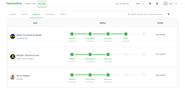
What led us to make this UX improvement?
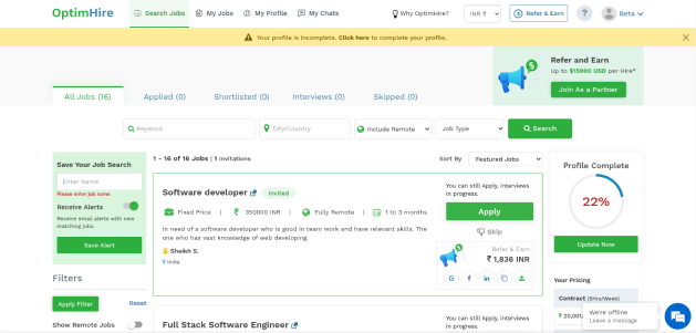
- Tracking for the applied jobs is bit difficult because the landing page is overcrowded with lot of elements and functionality
- Users overwhelmed by multiple visual contents can’t find primary findings in one go.
- In new design, every job stage is segregated properly to tabs
- All the invites and saved jobs can be viewed directly
- And other job stages are divided into major stages
- User can track all their applied jobs under the dedicated tab
- And take action on their upcoming interviews and pending offer actions easily
Thank your for your time 🙂
For feedback or collaboration or anything you want to say, let’s get in touch!
